About me

GIS Specialist

Imagen Viaje a Londres

I hold a bachelor’s degree in Geology and I am also a Geography technician with expertise in both cartography and topography. I am currently pursuing my Ph.D. in Environmental Sciences.
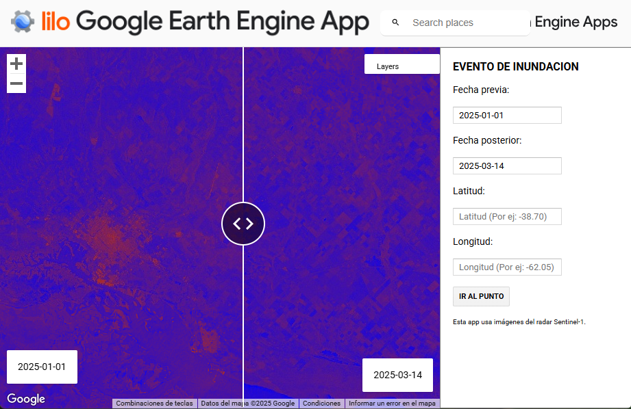
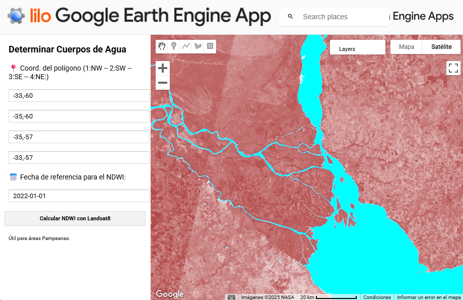
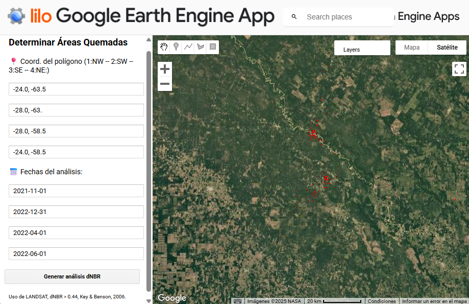
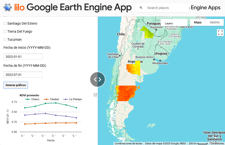
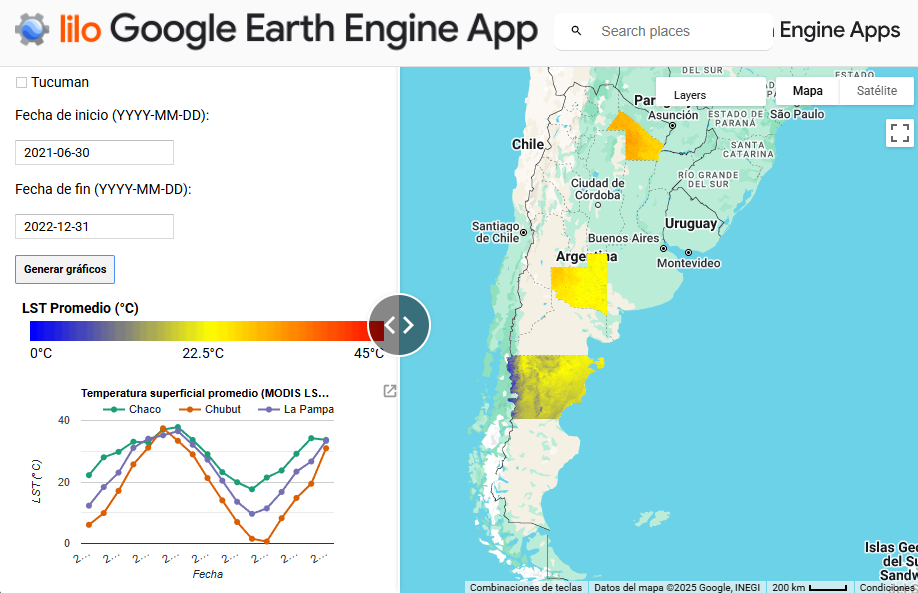
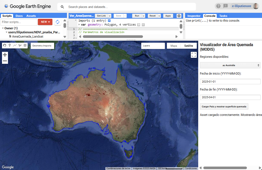
I visualize and analyze spatial data to better understand the environment we live in and to support decision-making in environmental management and land-use planning. I use tools such as QGIS, ENVI, ArcGIS Pro and Online, Google Earth Engine, Python, Excel and Power BI to process geographic information, create thematic and interactive maps, and provide theoretical insights into what is happening on the ground.
I really love making maps and enjoy processing data with Python, almost as much as traveling, looking rocks and hiking.

Curriculum

WORKS

In addition to my research on the Antarctic environment, I have developed some scripts that I share via GitHub, interactive maps in ArcGIS Online, and some Google Earth Engine apps.

FLOOD APP

This interactive application allows you to compare weekly radar images from the Sentinel-1 satellite on two different dates for a specific location in Argentina. You just need to enter:

  • Two dates (before and after the event).
  • The latitude and longitude of the location of interest.

The app displays a split panel with the radar images that highlight surface changes, making it easier to detect and monitor floods. It is ideal for environmental studies and natural disaster response.

go to the app
camp
camp

WATER BODY

This tool allows you to select an area by drawing a polygon with geographic coordinates and choosing a reference date. It then uses Landsat 8 satellite images close to that date to calculate the Normalized Difference Water Index (NDWI), which helps identify bodies of water in that area.

The app creates a mosaic of cloud-free images (less than 20%) and generates a map that clearly highlights water areas (NDWI > 0.1). In addition, it automatically exports the results for further analysis.

Ideal for monitoring wetlands, lakes, and rivers, especially in the Pampas region.

go to the app

FIRE APP

This tool allows you to identify fire-affected areas within a defined region using LANDSAT satellite images. You only need to provide the coordinates of a polygon and set two date ranges: before and after the fire.

The app calculates the dNBR index (Normalized Burn Ratio difference) to detect vegetation changes caused by fire. Using a scientific threshold (dNBR > 0.44), it highlights burned areas in red within the selected polygon.

Ideal for monitoring and analyzing the impact of wildfires, this application enables quick and visual assessment from anywhere in the world.

go to the app
camp
camp

SOIL APP

This tool allows you to select one or more Argentine provinces and a date range to analyze vegetation using satellite NDVI indices (MODIS data).
It displays the spatially averaged NDVI for the chosen provinces and generates monthly NDVI graphs for that period for each selected province. It also enables comparisons of vegetation dynamics between provinces and over time.
Ideal for monitoring the condition and changes in vegetation cover at a regional scale, supporting environmental, agricultural, and climate studies.

go to the app

TEMPERATURE APP

This interactive application allows you to select one or more Argentine provinces and a date range to visualize and analyze the average daytime land surface temperature (LST) using MODIS satellite data.
You select the provinces of interest and define a time period (e.g., one year). The app calculates the monthly average temperature for each selected province. It displays temperature layers on the map along with a comparative chart showing the temporal evolution. A color legend is included to interpret the temperature in degrees Celsius.
Ideal for monitoring surface climate and its variation across different regions of Argentina using open satellite data.

go to the app
camp
camp

WORLD FIRES APP

This interactive application allows you to select a region (Argentina, Australia, Uruguay, or the USA) and a date range to visualize the burned area detected by the MODIS satellite.
By simply choosing the country and time interval, the app loads the satellite data and displays on the map the areas affected by fires during that period, with a color scale indicating fire intensity.
Ideal for monitoring and analyzing the impact of wildfires in different regions of the world in a simple and visual way.

go to the app

Contact me

Personal information